|

Monogram style Weave
Step 1 Letter Prep
I tried to make it easy with the pictures, use them.
1. New Image 500 X 500 This will be raster 1 now flood fill it with white.
2. Rename it background. I renamed mine bk. I like it simple.
3. Click on Text tool and with colors of your choice and Font of your choice start your first letter. My Font was A&S Snapper Script.
4. For my colors I used Pattern Smooth Gold in Foreground and background I used Color #6e0f11.
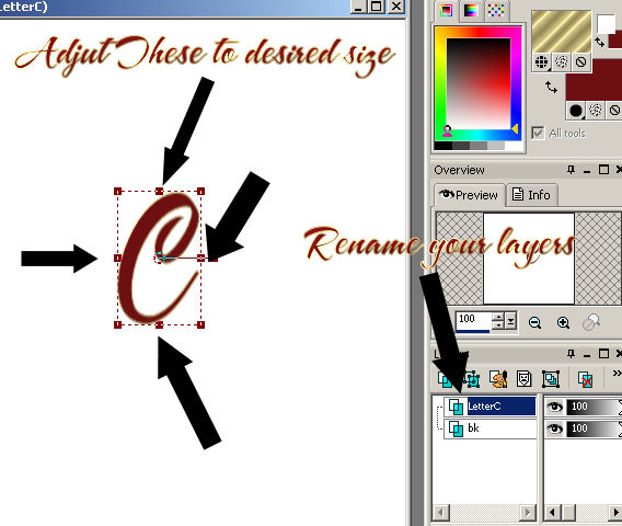
5. Make your first Letter Convert to a raster, rename it the letter you used. Mine is C.
6. Click on your raster deform tool and follow the picture below and size your first letter to your desired size.
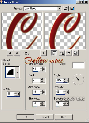
7. Inner Bevel. See picture for my settings.
8. Start your second letter, For this letter I used both the foreground and background Pattern Smooth Gold.
9. Place it were you feel it looks best, convert it to a raster and inner bevel it using the same settings as before. It should default to last used so you shouldn't have to change any settings. Rename it as the letter you used.
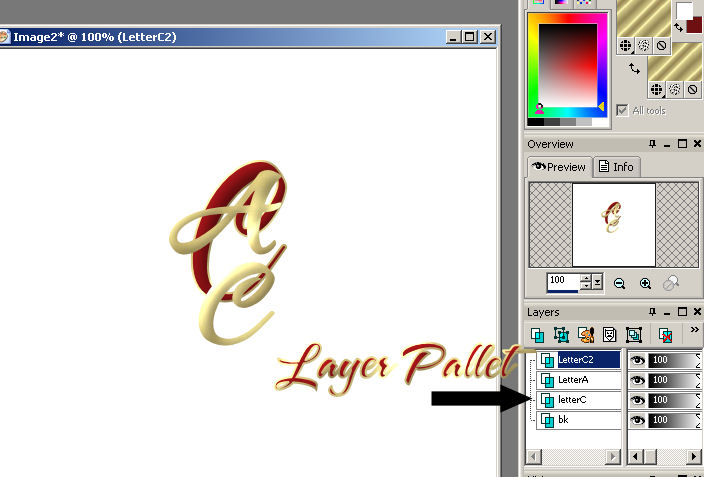
10. Finish it up with your third letter, convert it to a raster and inner bevel it using the same settings as before. Rename it as the letter you used. My 3rd letter was the same as the first one so I renamed it LetterC2. So I know which one I am working with.
NOTE: You may want to change the size of your font each time you use a letter. I kept mine at 72 because I liked how it look. Remember it's how you feel about the look and appearance of it so use your own taste.
Your layer pallet should now look like this:
Step 2 Erasing:
1. Click on your eraser to activate it.
2. Enlarge your project so you can see what your working on.
3. I'm going to show you how I use the eraser tool, but you decide what is the best way for you.
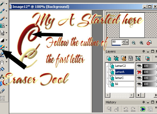
4. Starting with the second letter (mine is LetterA) FOLLOW MY EXAMPLE.
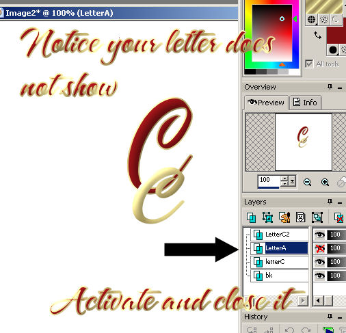
5. Activate it and then Close it (X marks the spot).
6. Now you should only see your original letter and the 3rd letter. Using your eraser tool to your desired size start following the outline of the first letter. (My first letter was C). Outlining should start at the edge of the first letter and outline both sides were the second letter is. I used setting 1 for the outline and then once I moved into the center of the
first letter I increased my eraser size so I could get a larger spot. Outlining the
sides of it helps to keep you from erasing to much of the second letter and looking more like they are weaved together.
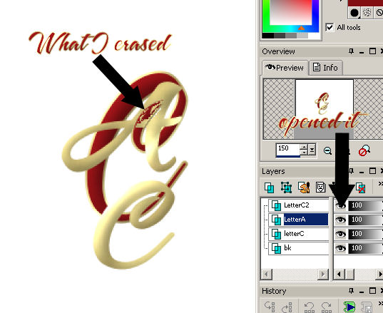
Note: Remember that if you want to see the progress of the letter your removing all you need to do is open it again by clicking on the X. See Example
7.
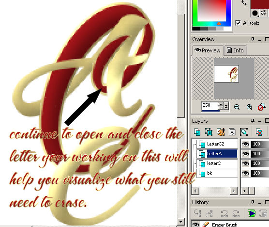
Remember to close it again until you get the entire outline of the first letter done and you have reached your desired effect.
This is what the A starts looking like after erasing it. I simply turned the LetterA on to view it, and closed it again to continue erasing.
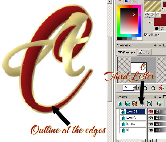
8. After you have completed the second letter move to the third letter doing the same thing. (Click on it to activate it then close it so you only see the first letter). Then with your eraser start to outline the letter.
See Example: Notice I have increased my canvas so I can see the letters more closely
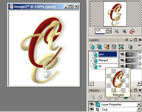
9. Merge it all visible and add a drop shadow.
10. I finished it up by adding a gem to it. You choose on how
yours well look.
11. You can add anything by weaving and making it look like it belongs a part of the picture see my examples below. Have fun with it and happy creating. 

Assignment:
1. Based on the lesson complete our tag using the supplies.
2. Using your own supplies send in another tag.
Send to your Instructor and the group; Please be sure to indicate the lesson name
Please do not copy, tear apart, email or share these lessons without my permission: Thank You for your understanding and respect for the hard work that goes into these lessons.

Graphics & Content © 2007 Cherie
All Rights Reserved.
|